
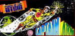
I just started full time nursing school yesterday, and worked all weekend to build up a catalog of posts here to help keep me current. I held off on posting any of them on Sunday because I wanted to do this appropriate piece on school supplies, but was too busy with school (already!) to get the job done Monday. Better late than never, here's a look at the Wonder Woman goodies my girlfriend got for me at Wall*Mart specifically, since that's the only place we've found them so far.
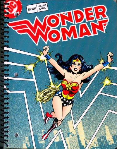
I've never read April 1983's Wonder Woman #302, but the cover by Ed Hannigan and Dick Giordano has always been popular with fans for decades. I love the juxtaposition between comic art and photo reference, and in this instance, the monochromatic background blurs the line between the two in a very appealing way.
All of the DC notebooks I've picked up this year have employed really basic, downright crude cropping techniques. I like that they cloned out the CCA advisory and went to the bother of replacing the old cover price with "ALL NEW!" Still, they cropped the bottom of Wonder Woman's symbol and the artist signatures, plus hacking the DC Bullet on two sides! I'm sure there's film of the original art, so why mangle a scan when they can simply remove and color over things like the UPC bar? The same vintage aesthetic that's given rise to increasingly "distressed" pre-fab clothing?

The notebook itself is great, with sturdy but flexible rubber binding that won't warp like my old aluminum ones did back in grade school. The covers are cardboard, and a tad then, but a quality glossy stock. The inside covers are black, with eighty wide ruled lined pages in between. Check out the back cover below.
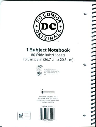
Innovative Designs, LLC puts these out under the DC Comics Originals branding I've seen on a lot of their licensed clothing. You'll also note the small Warner Brothers shield and DC 75 logo.
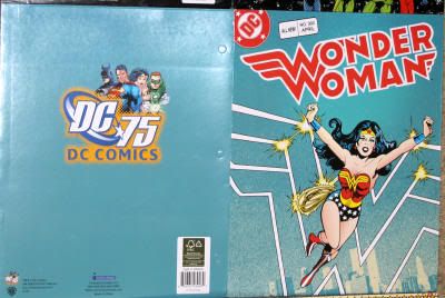
Finally, there's the simple twin pocket folder employing the same art as the notebook. I couldn't fit the whole thing, even closed, onto my scanner. Instead, here's a picture of the opened exterior. In this instance, the cropping is nearly identical to the notebook, except the DC logo is allowed its full breadth. I love how the back covers on all of these are color synchronized with the front. However, I'm not going to scan close-ups just for color variations.
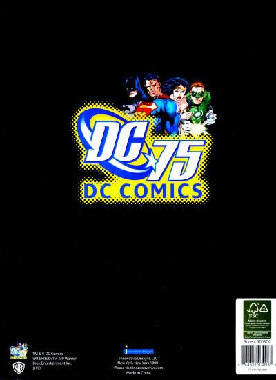
Here's a more detailed look at a twin pocket's back cover, this one for the Justice League of America #217 edition. There's a nice big DC 75th anniversary logo with art by Ed Benes and Jim Lee, plus a smaller version in the bottom left corner. The insides of the folders are plain, but continue the color scheme from outside.
I hope you enjoyed this review, and look out for another soon!


1 comment:
Ooooooh! At first I thought this was an old product you were featuring. Now I have to go Walmart shopping....again.
They should've kept the 60 cents in there to remind kids of how expensive comics are today.
Nice that they're using the old logo, too.
Too much to hope for a Martian Manhunter one, but I can dream.
Post a Comment